KNOWHOW -- making web applications accessible to seniors
Teamwork/Course Work | UX/UI Designer; User Analyst
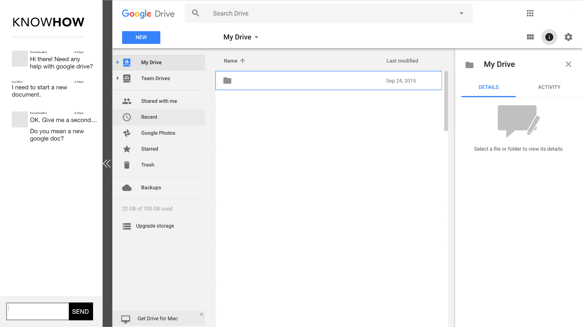
Our goal is to enable senior users to independently Our final design -- a chatbot answers questions and shows the user how to perform simple tasks without the user having to leave the page.
the problem
Older users are expected to understand and use web applications. Although some web applications contain help sections, it is a wall of text which does not selectively answer a user’s question. It may deter them from learning the application on their own and lead to reliance on family and friends.
USER CONTEXT
A 70 year old female who is an Art Therapist and Lecturer, and is an Apple user who owns an Apple watch, Macbook, and an iPhone. She states her comfort level with technology as a 3 out of 5.
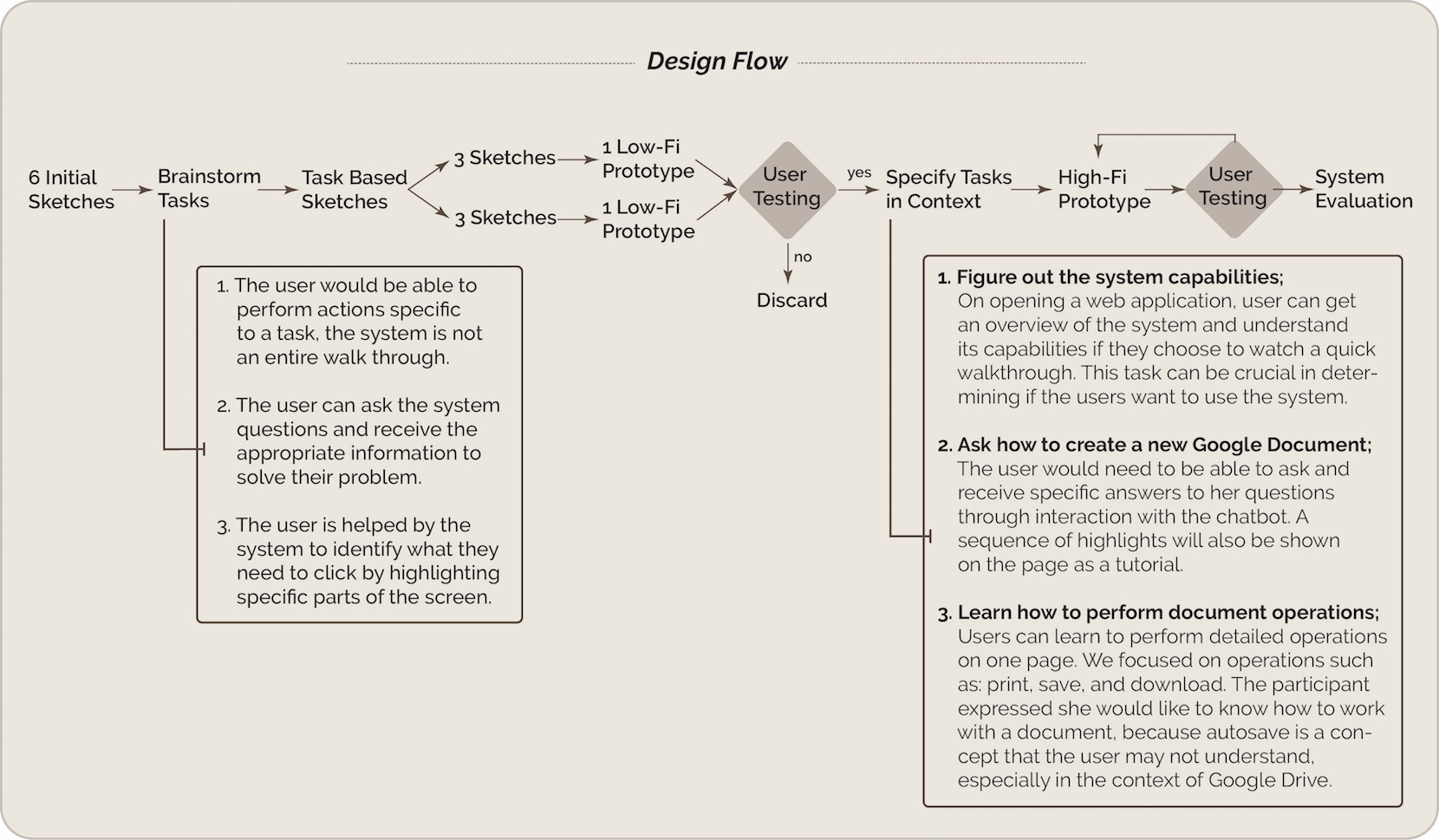
user tasks
What I want to hightlight here is we brainstormed user tasks, and revised them in context. We did not decide the tasks at the beginning, but tasks are indispensable for the 1st round of user test. Thus, we defined users' capabilities as the initial tasks. Once the user chosed one design idea from 2 low-fi prototypes, we specified tasks with detailed instructions. From the design flow, the process could be better understood.
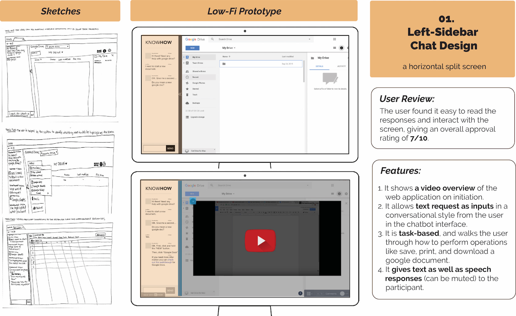
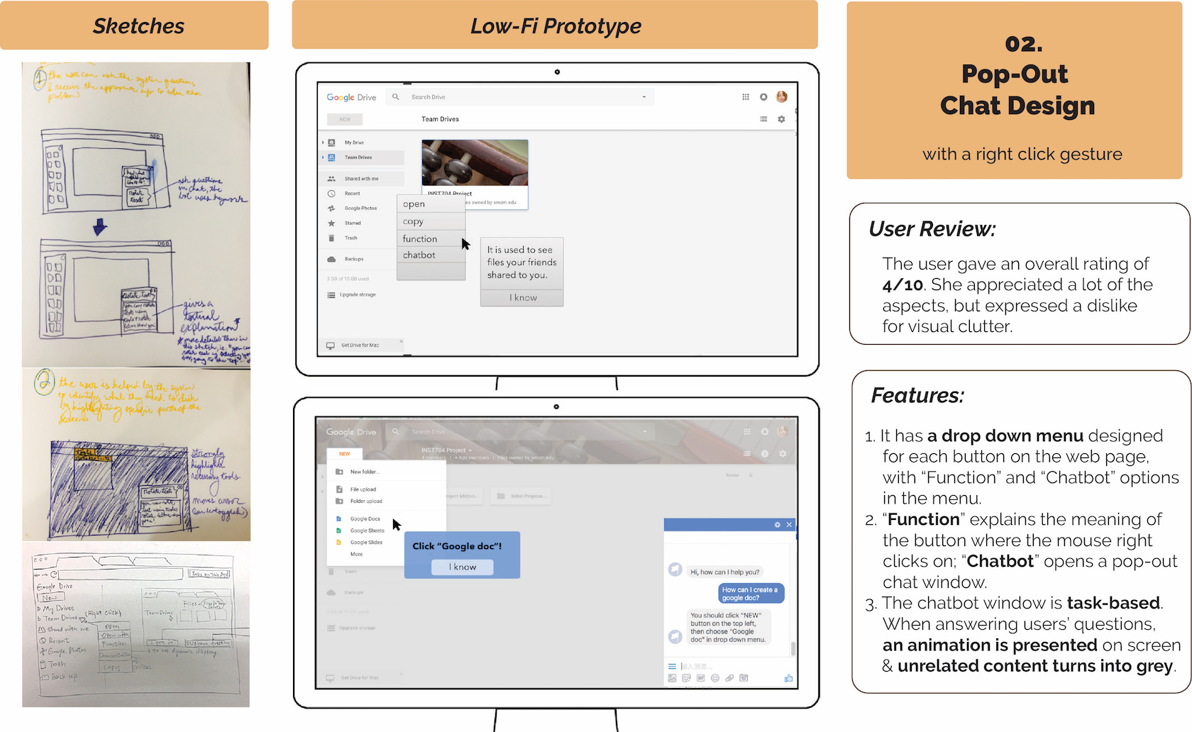
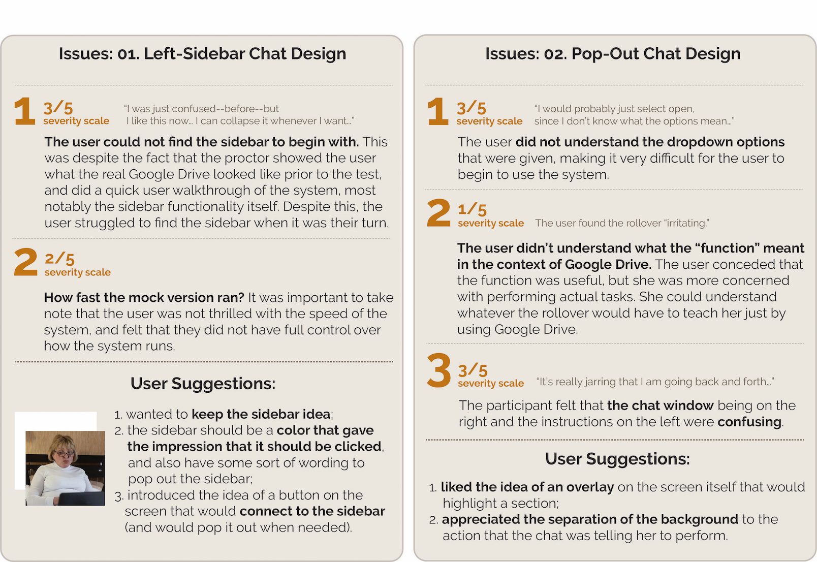
Comparing 2 design ideas
After chosing the two skeches and further created 6 low-fi prototypes, we asked the user to test the two version. The user rated the design, explained the issues she found, and gave her suggestions.
Final Design
Based on user's suggestion, we kept the side-bar idea and the hightlight function. The chatbot intelligent agent is hybrid of rule based and machine learning. So if the user wants to know how to download a document.
- We provide them a textual instruction in the chatbot window.
- We highlighted the buttons to be clicked on the application screens in the appropriate order. These highlights are shown using the technique of greying out the entire screen and only showing the button which is the current call-to-action on the screen.
- We also provided users with a video overview when they opened a new web application. The video is not auto played and the user can play or skip them as per their need.
- We distinguished the chat interface by placing it to the left of the application occupying the total height of the web browser.
A video demonstrates our process and it shows our user performing the tasks on the system itself.
Evaluation
Likes
- The large font size and font color of the text on the chatbot interface.
- The conversational nature of the chatbot made it easy to ask questions.
- The chatbot gave brief and specific solutions to help the user understand what she needed to do.
- Liked the separation between the chatbot and Google docs.
Dislikes
- For the chatbot, there was no send button in the final version.
- For the prompt text on the chatbot, “Hey, ask me something...” the contrast was too light for her to see.
- She also wished that she could talk to the system, instead of entering text.
Demo
For detailed research content, check our KNOWHOW Report.