Data Visualization
Individual Work/Course Work
a. Hotel Operation Situation
To elaborate hotel operation situation by a large quantity of visualized data.
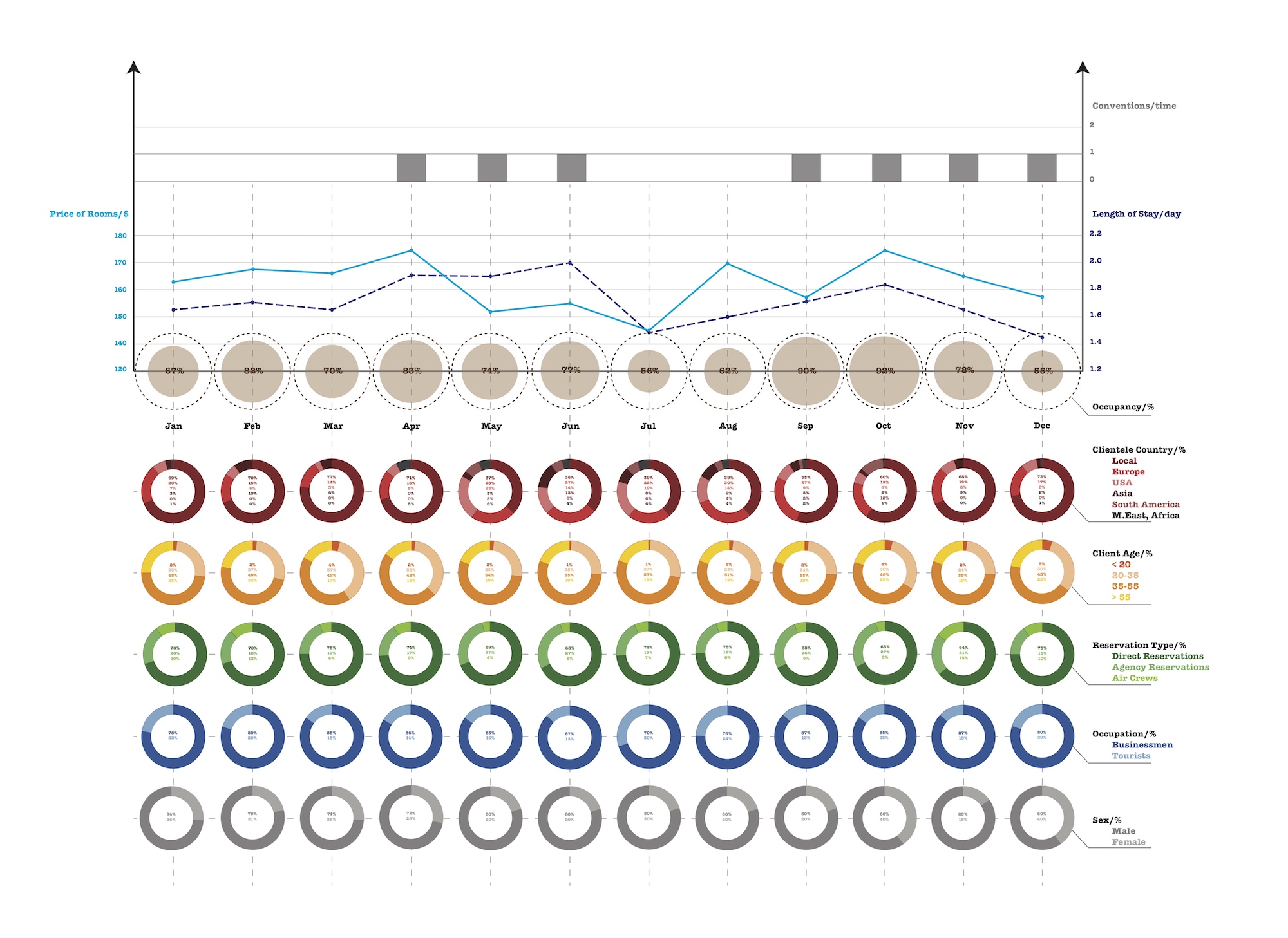
I used the line chart for data has a tendency, like price and length of stay; pie charts (transformed pie charts) for data presented in ratio. The Column chart is only for “conventions” where the number shows up infrequently and in integers. Colors (sequential colors) are used to divide perspectives to explain client composition. The dotted line is also used to differentiate one from the other line.
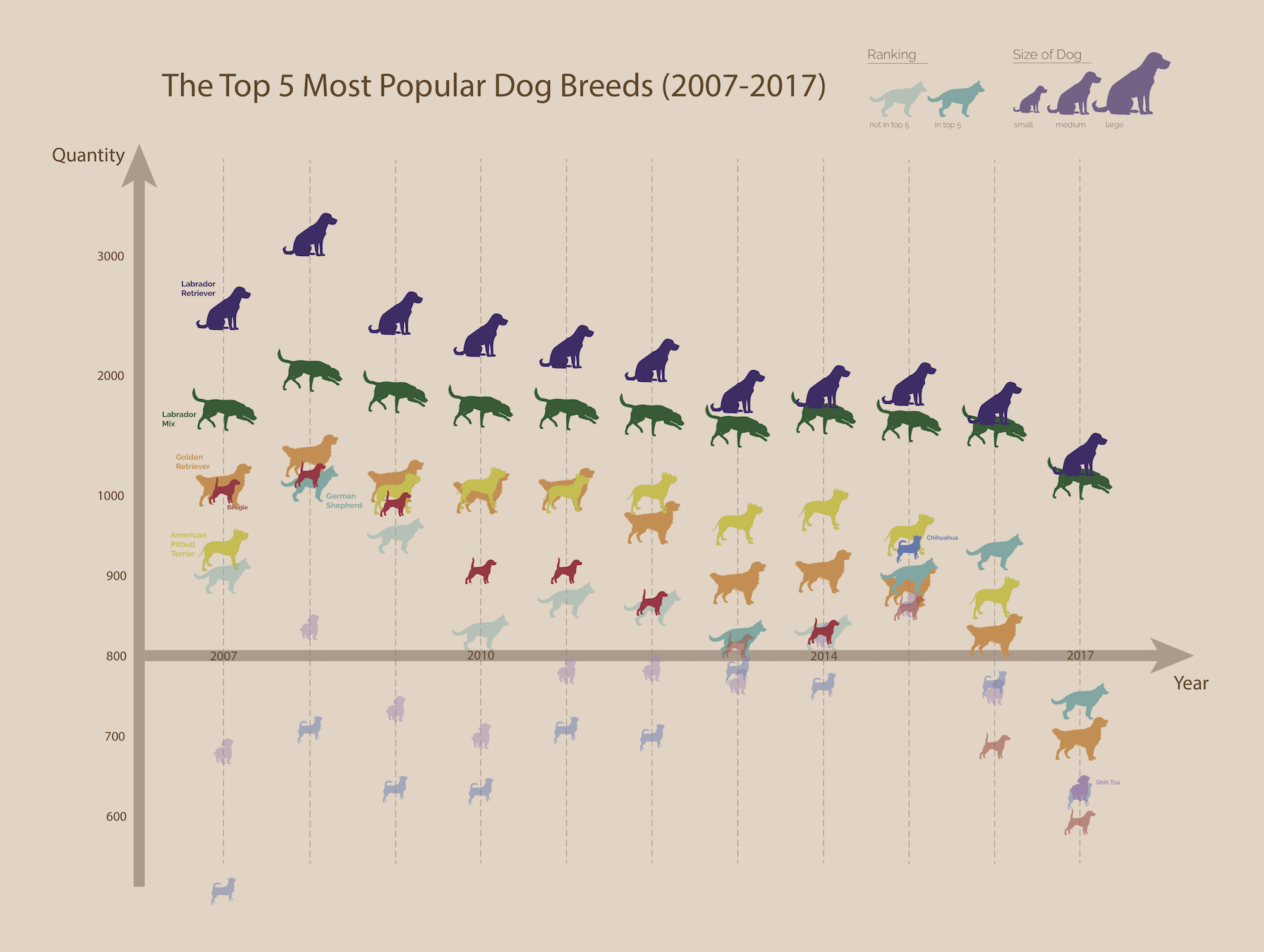
b01. Dogs Breeds -- Static
To show dog breeds trends over the decade from 2007 to 2017 in Philadelphia.
b02. Dogs Breeds -- Dynamic
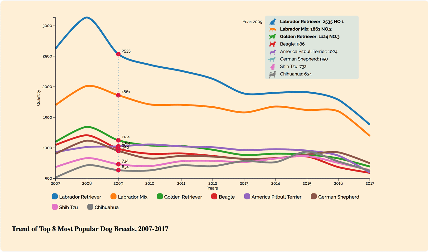
A gif demo
Now, really move your mouse over the interactive image. The image may not appear on Chrome, try other browsers!