Park App Design -- get millennials to parks
Teamwork | User Researcher; UX Designer
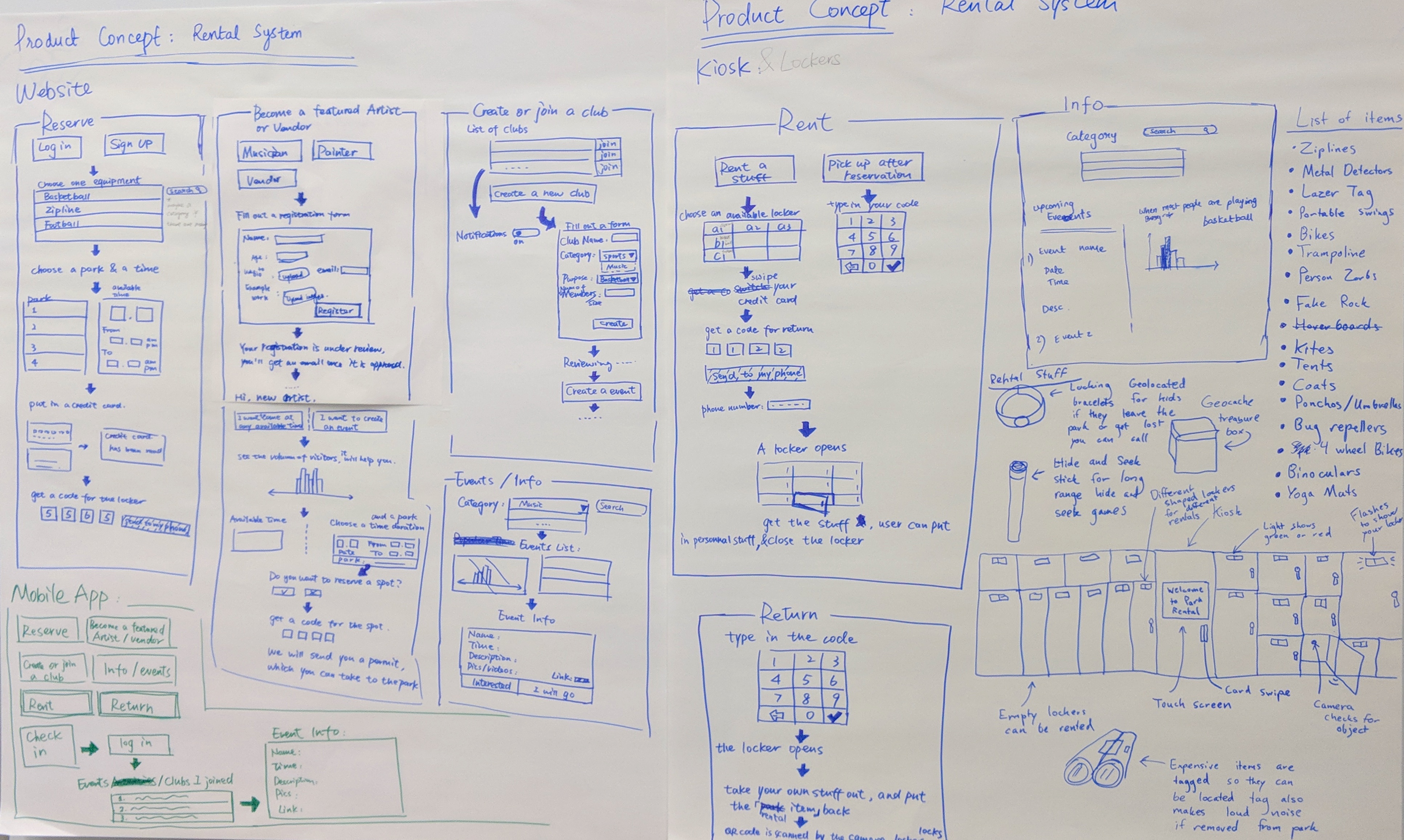
This project aims to get millennials to parks. To do that, we conducted 12 field interviews; interpreted them into 8 typical user identities and 12 places in a park map. We also drew 3 product concepts: Park Map App, Park Share System, and Park Arts System. The client chose to follow up the Park Map App design.
Experience models
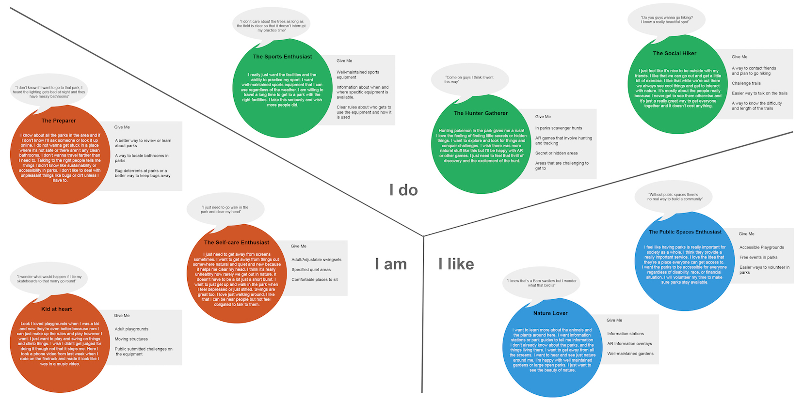
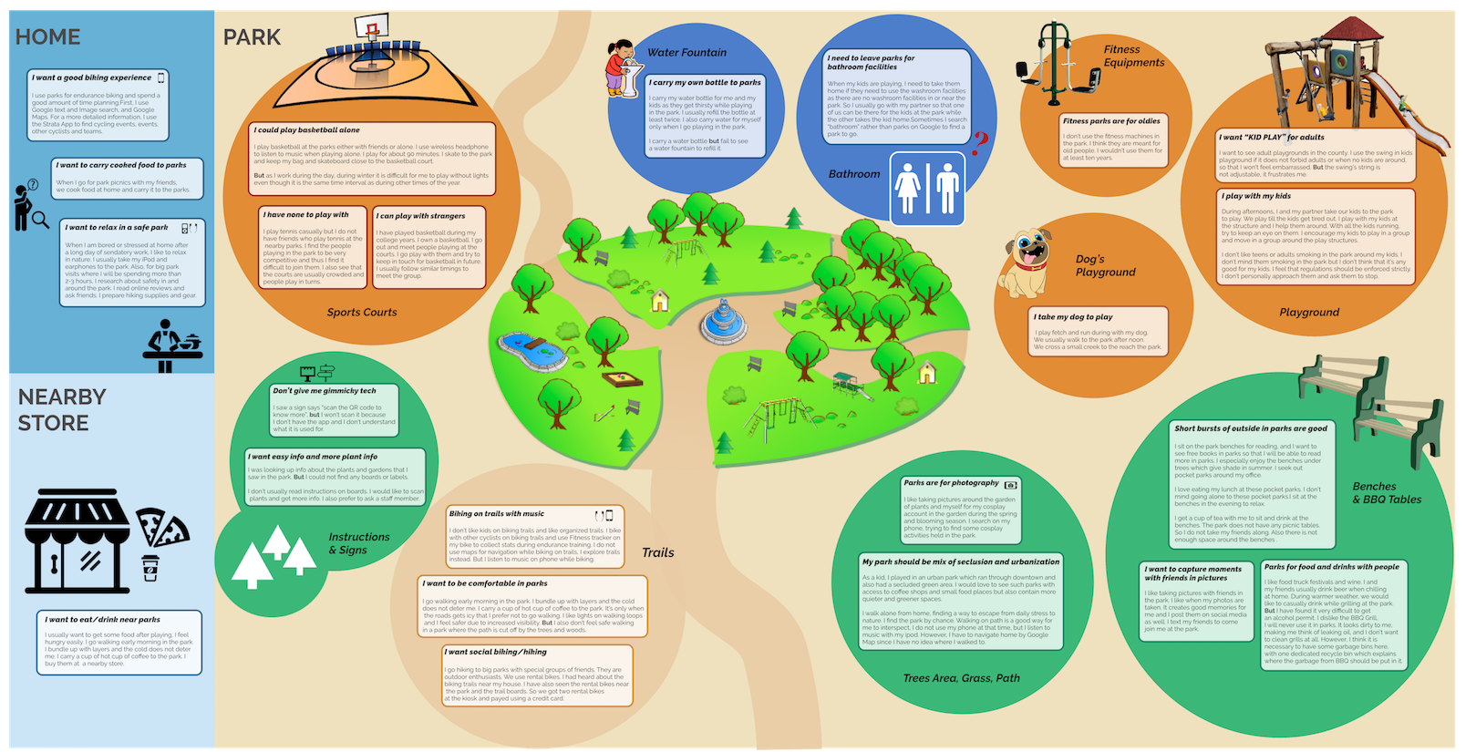
We conducted 12 field interviews in parks. Within the 48 hours after the interview, we researchers have to translate the observation and conversations into affinity notes and diagrams. Affinity notes capture all details during the interview, and each one should also be explained by itself. Experienced models we generated are an identity model (left) and a physical model (right).The physical model has:
- Chunks of space;
- Physical layout of a park;
- Users' issues happened in the specific place.
affinity diagram
After sticking all notes of 12 interviews (over 50 notes for each), researchers need to consolidate them into hierarchy.
- Yellow stickers are affinity notes.
- Blue and pink stickers are high-level summaries.
- Green stickers are top findings, either values user concerned or issues user worried about.
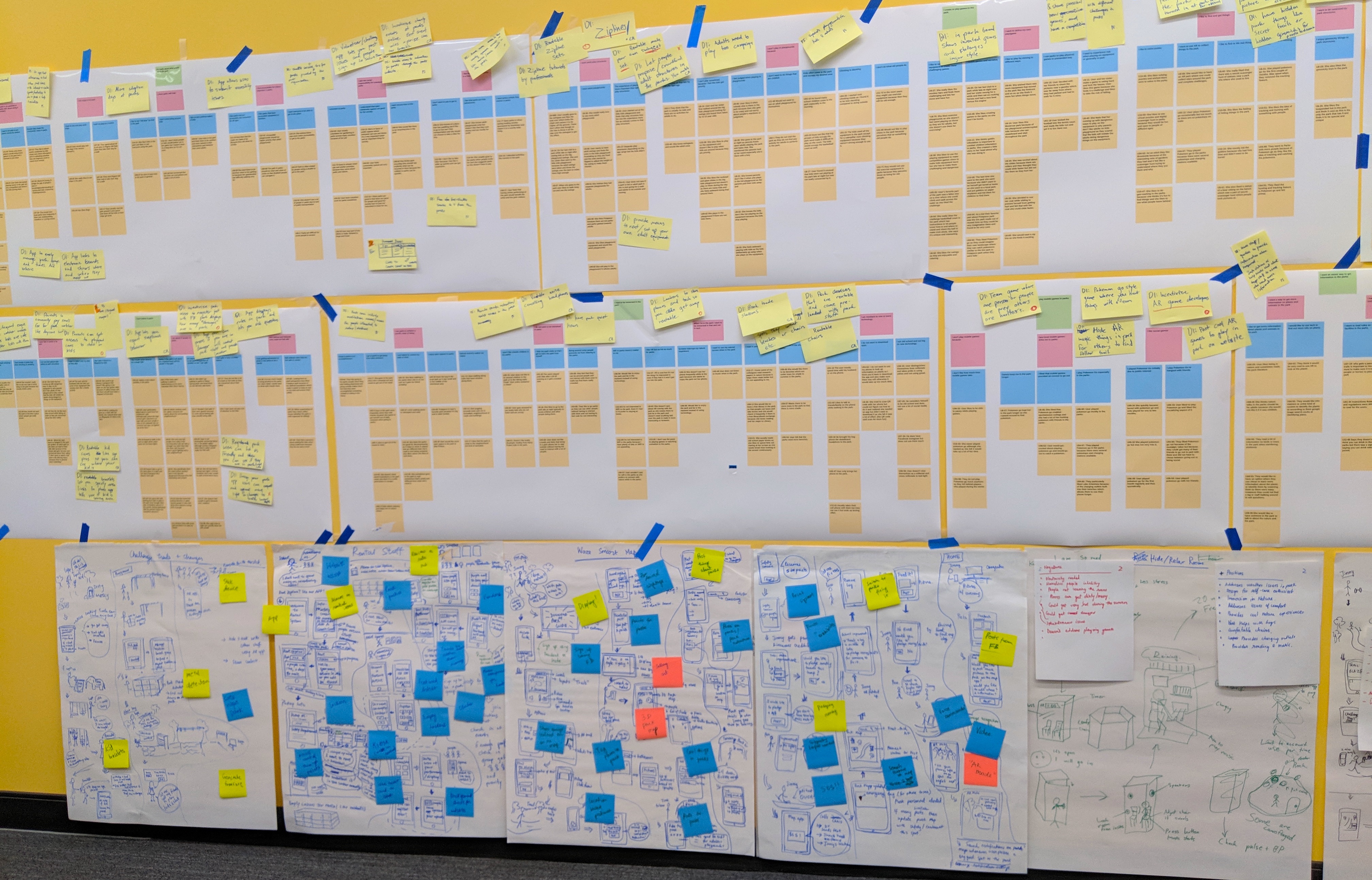
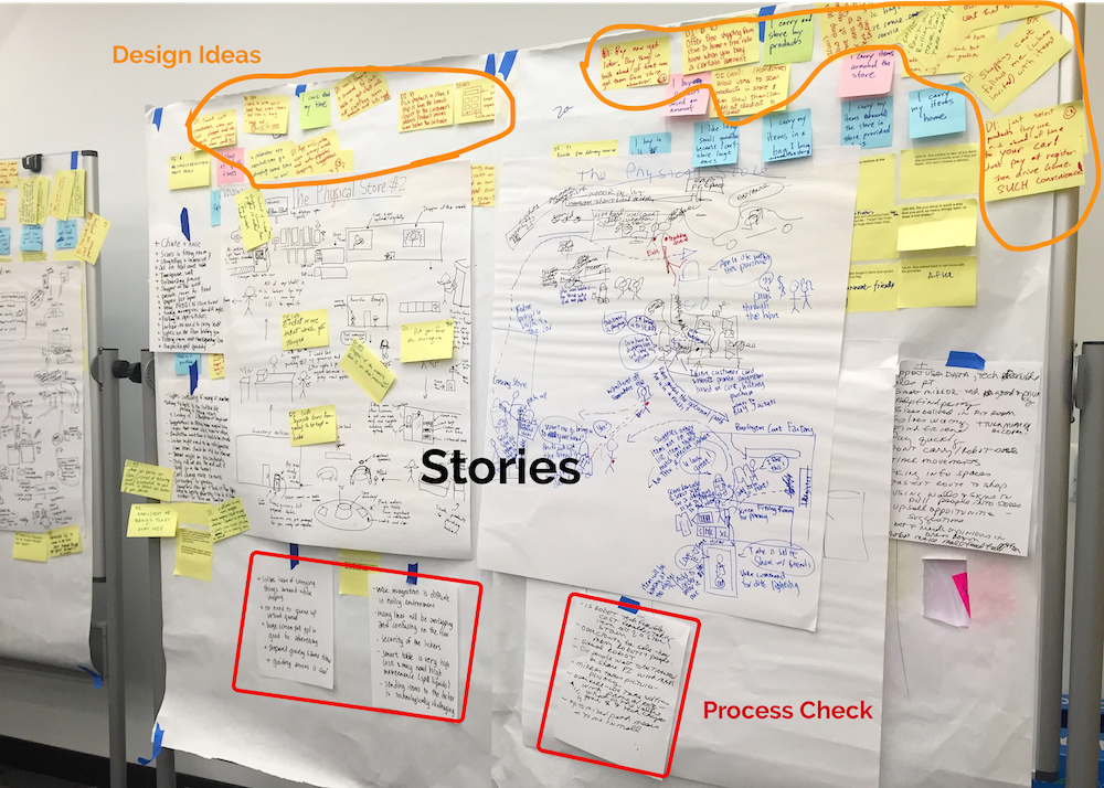
Ideation
After a silent design session during which each researcher walked around all the consolidations and wrote down design ideas (DI), we collected main issues and these DIs from the wall, and aggregated them into 8 main DIs. Then the next phase was to brainstorm digial products could be made and drew visions on flipchart. For each vision, a process check (positives+ & negatives-) to make a list of pros and cons is crucial.
Interaction Design
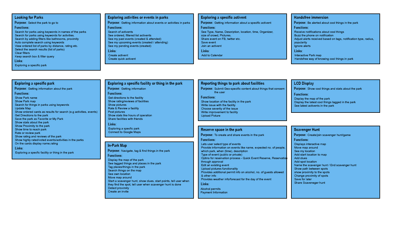
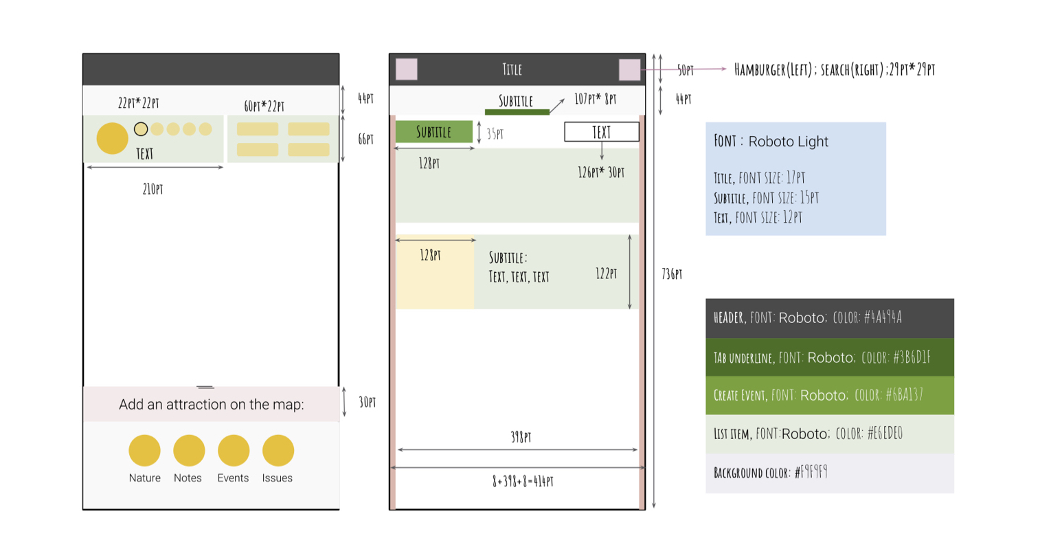
UED (left) helps us determine functions on each focus area, as well as the navigation from one page to another. Design pattern (right) defines the layout, and UI elements which include colors, fonts, font size.
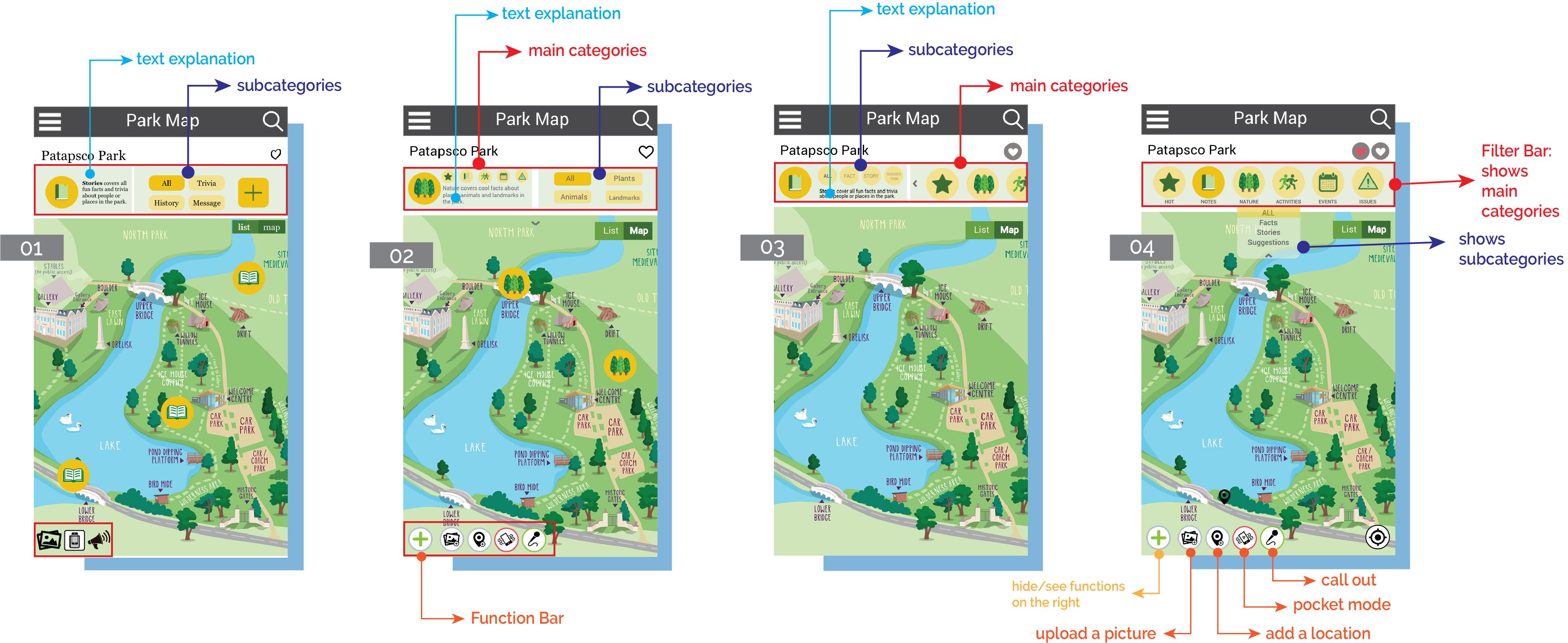
How did we iteratively design the filter bar on the park map page? We designed 4 ways of interaction on the filter bar (the top red frame on park map-01, 02, 03 & 04). There are five main categories in this bar.
- 01 has a plus button, but users thought it means more things to show up.
- 02 shows other 5 categories as smaller icons on the left, with subcategories on the right.
- 03 changes the left and right elements in 02, because users mainly toggle between main categories which should have bigger icon size.
- 04 abandons text explanations (seen from 01 to 03), replacing it by adding titles under icons. The dropdown menu is designed to maintain the mininal design.
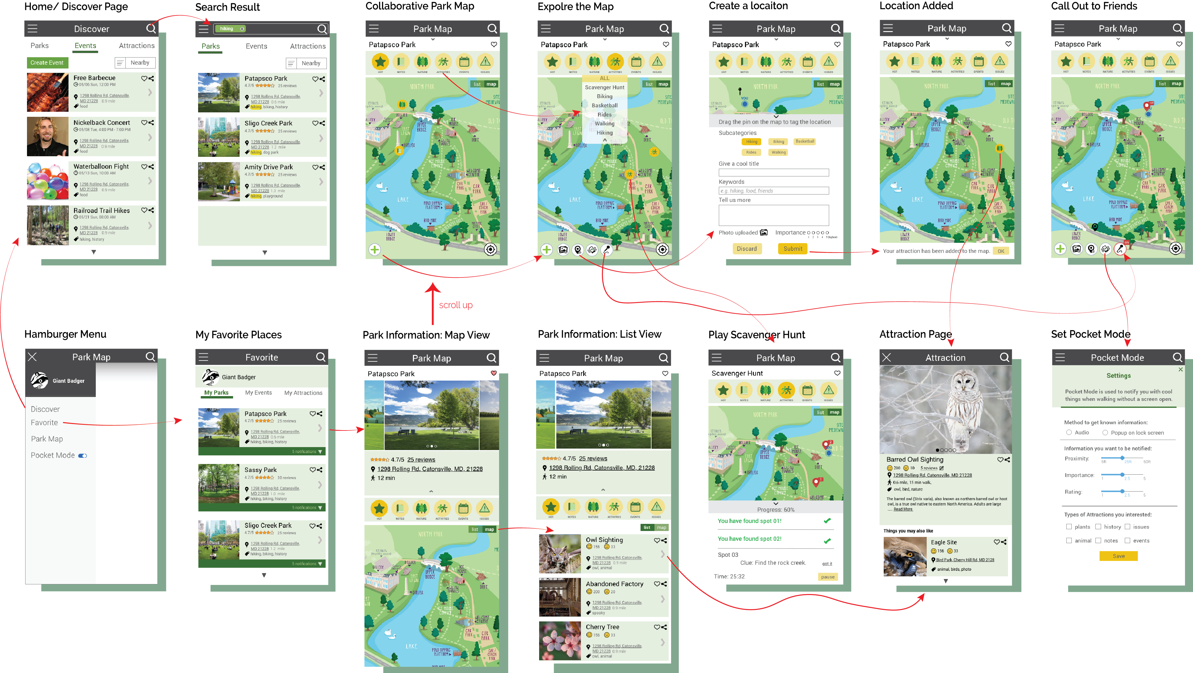
Screen Hierarchy
Work Space